

The IT Spend Analysis sample analyses the planned vs. actual costs of an IT department. This comparison helps us understand how well the company planned for the year and investigate areas with huge deviations from the plan. The company in this example goes through a yearly planning cycle, and then quarterly it produces a new latest estimate (LE) to help analyse changes in IT spend over the fiscal year
This sample is part of a series that shows how you can use Power BI with business-oriented data, reports, and dashboards. It was created by obviEnce with real data, which has been anonymized. The data is available in several formats: content pack, .pbix Power BI Desktop file, or Excel workbook. See Samples for Power BI.
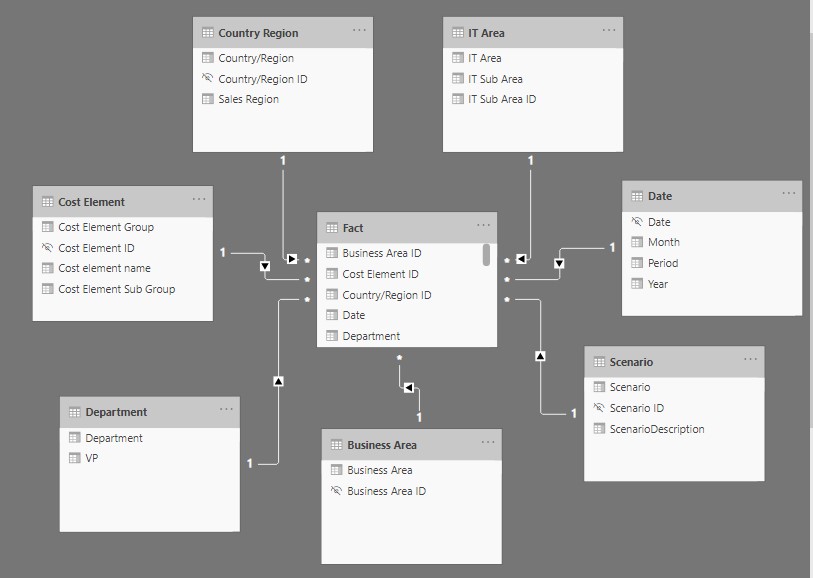
I have replicated the sample dashboard from Microsoft to practise some hands-on experience. The model below shows the attributes of fact and dimensional tables and their relationship.
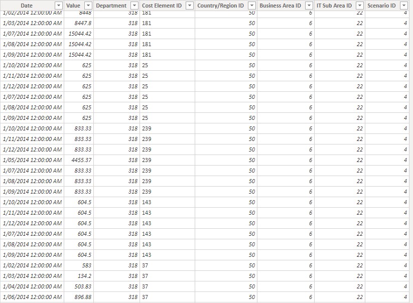
Below is the fact table screenshot that shows the value amount spent with date and time in regard to the department, type of cost element, country and business area with their scenario details.
Using the scenario description and the fact value we need to create the following measures as mentioned below using the formula’ s in fact table.
Actual = CALCULATE([Amount], Scenario[ScenarioDescription]=”Actual”)
Amount = TOTALYTD(SUM([Value]), ‘Date'[Date])*.3
LE1 = CALCULATE([Amount], Scenario[ScenarioDescription]=”Latest Estimate 1″)
LE2 = CALCULATE([Amount], Scenario[ScenarioDescription]=”Latest Estimate 2″)
LE3 = CALCULATE([Amount], Scenario[ScenarioDescription]=”Latest Estimate 3″)
Plan = CALCULATE([Amount], Scenario[ScenarioDescription]=”Plan”)
Var LE1 = [Actual]-[LE1]
Var LE1 % = DIVIDE([Var LE1],[LE1], BLANK())
Var LE2 = [Actual]-[LE2]
Var LE2 % = DIVIDE([Var LE2],[LE2], BLANK())
Var LE3 = [Actual]-[LE3]
Var LE3 % = DIVIDE([Var LE3],[LE3], BLANK())
Var Plan = [Actual]-[Plan]
Var Plan % = DIVIDE([Var Plan],[Plan], BLANK())
Once the measures are done, we can now start working on our dashboard.
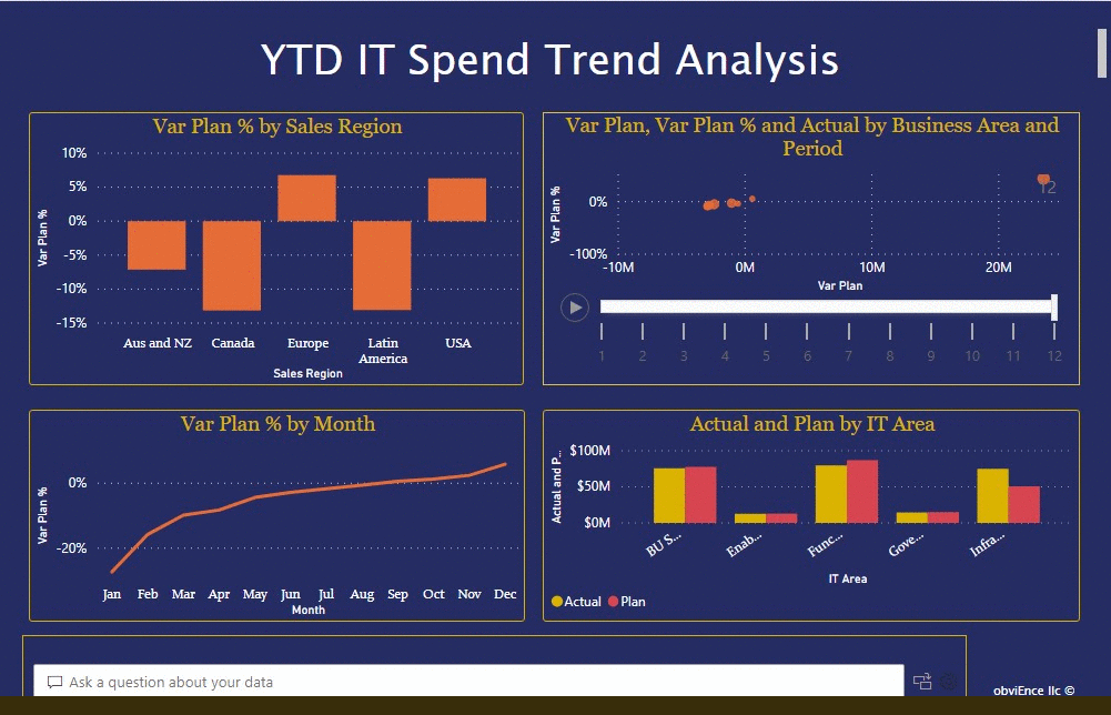
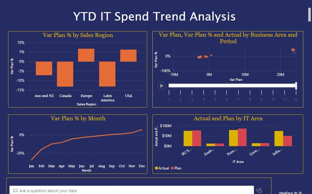
The first one “YTD IT Spend Trend Analysis” page
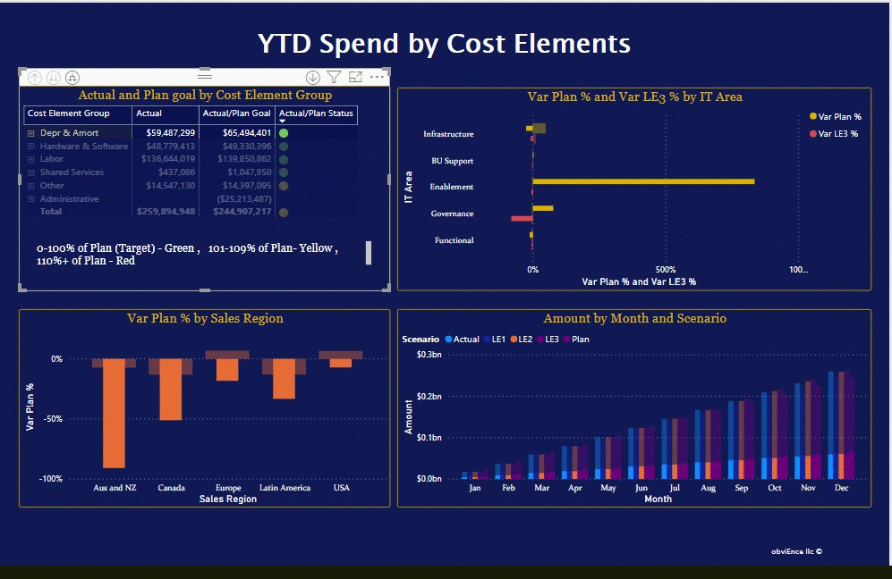
When you select the Var Plan % by Sales Region dashboard tile, it displays the YTD IT Spend Trend Analysis page of the IT Spend Analysis Sample report. Briefly, we see that we have positive variance in the United States and Europe and negative variance in Canada, Latin America, and Australia. The United States has about 6% +LE variance and Australia has about 7% -LE variance. Similarly from the other visuals we can understand the spend trends. From the Select Ask a question about your data.
From the Questions to get you started list on the left side, select what is the plan by IT area.
YTD Spend by Cost Elements page
Return to the dashboard and look at the Variance Plan %, Variance Latest Estimate % – Quarter 3 dashboard tile. Select the Infrastructure bar in the Var Plan % and Var LE3 % by IT Area chart on the lower right and observe the variance-to-plan values in the Var Plan % by Sales Region chart on the lower left. Select each name in turn in the Cost Element Group slicer to find the cost element with the largest variance. With Other selected, select Infrastructure in the IT Area slicer and select subareas in the IT Sub Area slicer to find the subarea with the largest variance.
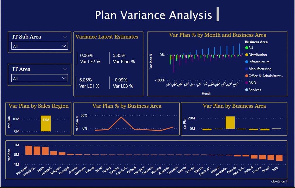
Plan Variance Analysis page
Select the Plan Variance Analysis tab on the bottom of the page. In the Var Plan and Var Plan % by Business Area chart on the left, select the Infrastructure column to highlight infrastructure business area values in the rest of the page. Notice in the Var plan % by Month and Business Area chart that the infrastructure business area started a positive variance in February. Also, notice how the variance-to-plan value for that business area varies by country, as compared to all other business areas. Use the IT Area and IT Sub Area slicers on the right to filter the values in the rest of the page and to explore the data.
.

BI Developer specialized in SQL Query Development/ SSIS/ SSAS/ SSRS /Power BI/ MS Office. Enjoy working in data analysis and presentation, challenging projects where I can uncover valuable business insights for an organization from previously under-utilized data sources and creating custom made reports and interactive dashboards