

Hello Friends, in this article i am going to share some of my dashboard samples i have created using NSW public transport, School and Property median value data available online.
My dashboard shows how the property median value of each suburb differs from the availability of school and transport accordingly.
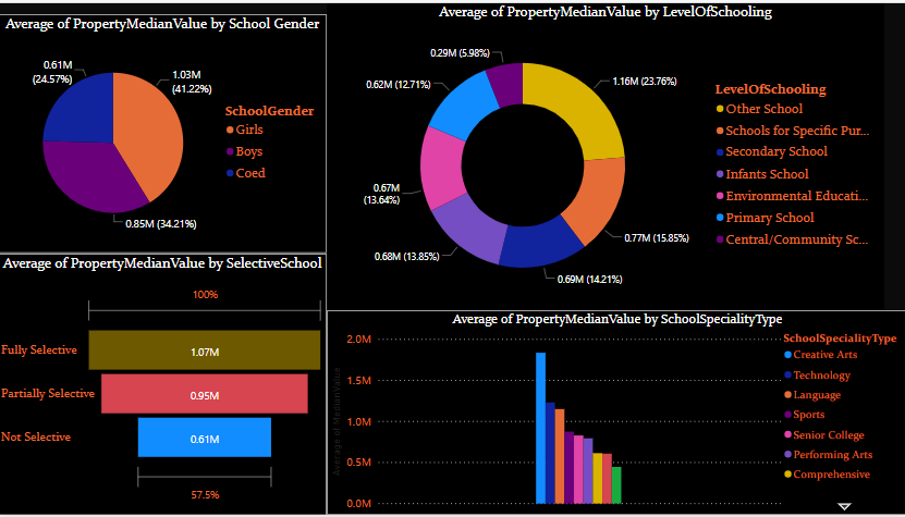
The above image illustrates the Property median value by School gender, Type of School Selective school, level of schooling and school speciality type.
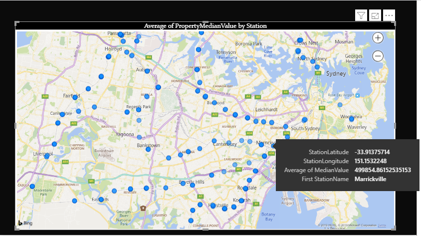
The image Average of property median value by station is displayed using a map.
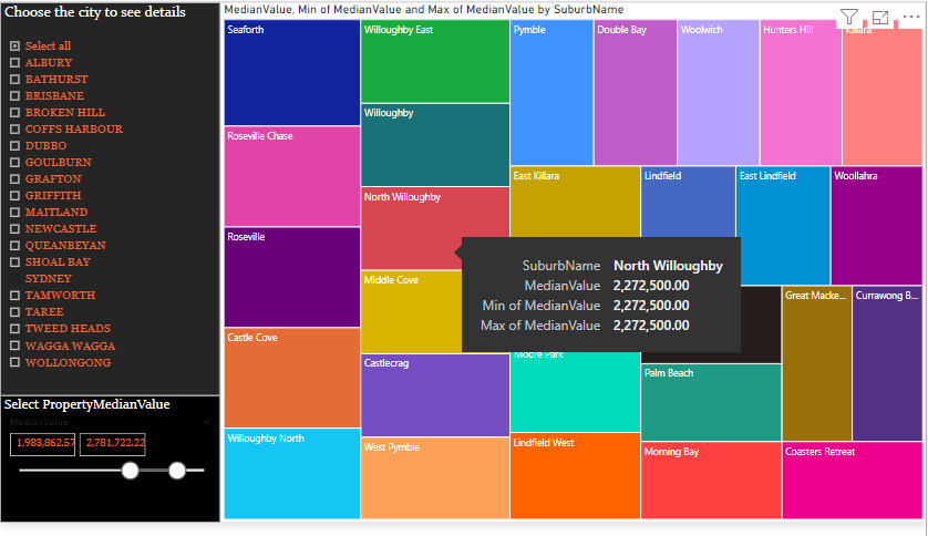
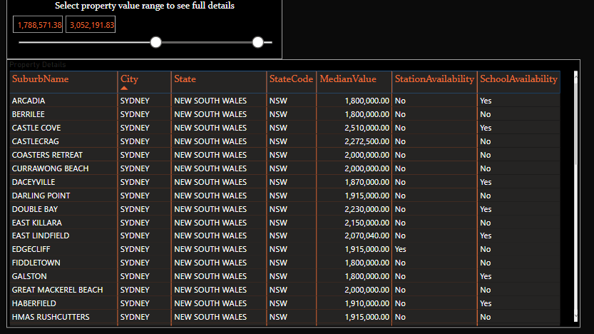
I have used a slicer in above two images to filter the details according to our need.

BI Developer specialized in SQL Query Development/ SSIS/ SSAS/ SSRS /Power BI/ MS Office. Enjoy working in data analysis and presentation, challenging projects where I can uncover valuable business insights for an organization from previously under-utilized data sources and creating custom made reports and interactive dashboards